
For some time I’ve been thinking that the image I use for my header could do with a little makeover. Don’t get me wrong, I love the drawing. It represents a very important part of my past, which I do not wish to forget. But the problem lies with the fact that it is from my past. I have changed, my drawing style and taste has changed, and I want this to be reflected on one of the most prominent drawings of my blog, the header.
I started to think of a makeover when I decided it would be a good idea to make business cards for myself. The problem I found was, that no matter how I tried my header design just would not work with the concept. Putting it left, right, center, I didn’t like it. And then I had this idea of having a similar themed drawing, but with filigree design. I got the idea when I saw the cover of my husband’s latest treasure, Rahib Abou-Khalil‘s Morton’s Foot.
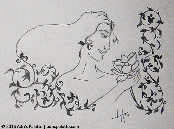 I have to confess his music is not my usual cuppa. But one thing is for sure, its tunes strum the most hidden strings in my soul. A couple of days have passed, but I still hear them. So picking up the main motif of the cover design and playing with it a bit seemed the most natural thing. I found myself doodling and making some filigree here and there. I wanted to have a female figure in the center, and before I knew it the portrait I used for Saint Anne was looking at me once more.
I really like this drawing. It is getting closer to what I imagine for a new header. But it is just the first little doodle. I want to play with the idea a little more to see how it fits some of the other concepts I’d use it for. We’ll see!

2 Pingback